
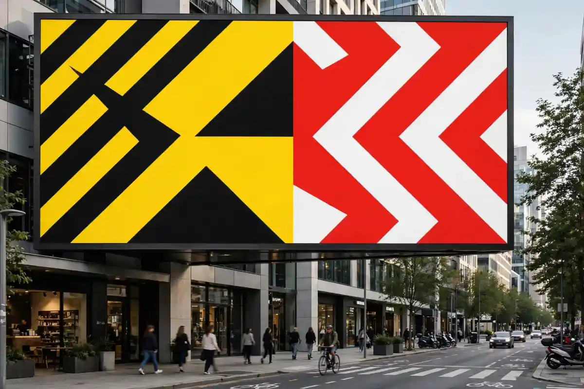
Your billboard has roughly three seconds to register with a driver moving at highway speed. In that window, color and contrast do more work than copy, logo, or layout combined. Before anyone reads your headline, their brain has already processed the visual field and decided whether your board is worth a second glance. Billboard contrast and color are not design preferences. They are performance variables that directly affect recall, readability, and campaign results.
Most brands approach billboard creative the same way they approach print or digital work. That thinking leads to boards that look polished on screen and disappear on the road. Outdoor advertising operates under different visual rules, and understanding those rules is what separates creative that drives results from creative that gets overlooked.
Table of Contents
Billboard Contrast and Color: Why the Brain Responds Before the Eyes Focus
Visual contrast is the degree of difference between two tones or colors in the same frame. The higher the contrast, the faster the human eye separates the foreground from the background and locks onto the message. At highway speeds, that split-second separation determines whether your board gets read at all.
Research consistently shows that high-contrast billboard designs improve ad recall by up to 38 percent compared to low-contrast alternatives. That gap exists because the brain’s visual processing system prioritizes objects that stand out from their surroundings. A board that blends into the sky, treeline, or built environment behind it gets filtered out before conscious attention ever engages. Understanding how that exposure translates into audience reach starts with knowing how billboard impressions are calculated and what variables affect how many people your creative actually reaches.
How Color Psychology Shapes Audience Response
Color communicates tone, urgency, and brand personality before a single word registers. Red signals energy and action, making it effective for direct response and time-sensitive campaigns. Blue builds trust and reliability, a strong fit for financial services, healthcare, and professional brands. Yellow draws the eye faster than almost any other color but requires a dark contrasting element to stay legible at a distance. Black-and-white pairings deliver the highest raw contrast and work across nearly every brand category.
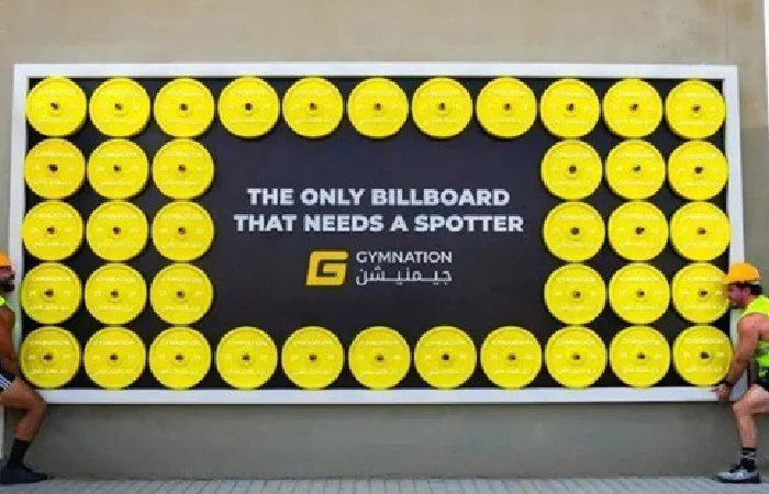
The surrounding environment is also part of the design brief. A board against a green treeline benefits from warm tones that contrast with the backdrop. An urban placement surrounded by steel and concrete calls for a different approach than one set against an open sky.
Billboard Contrast and Color: The Combinations That Perform Best
Not all high-contrast pairings are equally effective. The strongest combinations pair colors the human eye separates most sharply:
- Black on yellow ranks among the most legible pairings at any distance or speed. The tonal gap between the two is extreme, which is why it dominates safety and warning signage worldwide.
- White on dark blue delivers a strong contrast with a more polished, professional tone. It performs well for financial services, healthcare, and corporate brands that need visibility without sacrificing credibility.
- Black on white offers the highest possible tonal contrast and works across virtually every brand category. It performs consistently on both static and digital formats.
- Yellow on black reverses the first pairing with equally strong results. The warm foreground against a dark background creates immediate visual pop, particularly effective for retail and food service brands.
Combinations that share similar tonal values, such as light gray on white, dark navy on black, or red on green, create optical interference that slows processing and reduces recall. A useful test before finalizing the creative is to convert the design to grayscale. If the text and background still read as distinct tones in black and white, the pairing will hold up in real-world viewing conditions. If they merge, the contrast is insufficient regardless of how vivid the color version appears on a monitor.
Static vs. Digital: How Format Changes the Color Rules
A design that works on a static face can fail on a digital one. Static billboards reflect ambient light and perform best with bold, saturated colors and strong tonal contrast. White backgrounds read cleanly in daylight.

Digital billboards emit light rather than reflect it. On an LED panel, white is produced by combining red, green, and blue at maximum brightness, which creates glare and washes out surrounding elements. Dark backgrounds with light text perform significantly better, especially at night. Brands that run the same creative across both formats often see performance gaps that trace directly back to this difference. Operators like Lamar maintain both static and digital inventory, and their production specs reflect the format-specific requirements your creative team should follow.
Why Limiting Your Palette Improves Performance
A common creative mistake is overloading a billboard with too many colors. Each additional color adds visual complexity and increases the cognitive load on a viewer processing the board at speed. Three colors, a dominant background, a contrasting text color, and one accent for the logo or CTA are the standard that consistently outperforms busier designs.
Brand guidelines sometimes push designers toward full-palette executions that work well in digital environments where the viewer controls their pace. On a billboard, the viewer is moving, and the board is fixed. Simplicity serves recall, and recall is the primary performance metric for outdoor advertising.
Billboard Contrast and Color: Applying These Principles to Your Next Campaign
The gap between strong outdoor creative and weak outdoor creative often comes down to decisions made before the design brief is written. Confirm the format, static or digital, before finalizing color choices. Research the environmental backdrop of the specific placement you are buying. Test contrast in grayscale before approving final creative. And keep the palette tight enough that the most important element on the board, your brand or your message, is the first thing the eye lands on.
Billboard Connection works with brands across every category to match strong creative strategy with the right placements. Contact us today to start building a campaign where your contrast and color choices work as hard as your copy.